KIWA
Usage : Retail
Location : Cheongjin-dong, Seoul
Floor area: 26 sqm
Year : Nov, 23
Object : OBJECT LEUCI
Photo : Cho donghyun
키와는 광화문 디타워에 위치한 더스퀘어 치과에서 운영하는 구강용품샵이다.
KIWA is an oral care product shop operated by The Square Dentistry, located in Gwanghwamun D Tower.
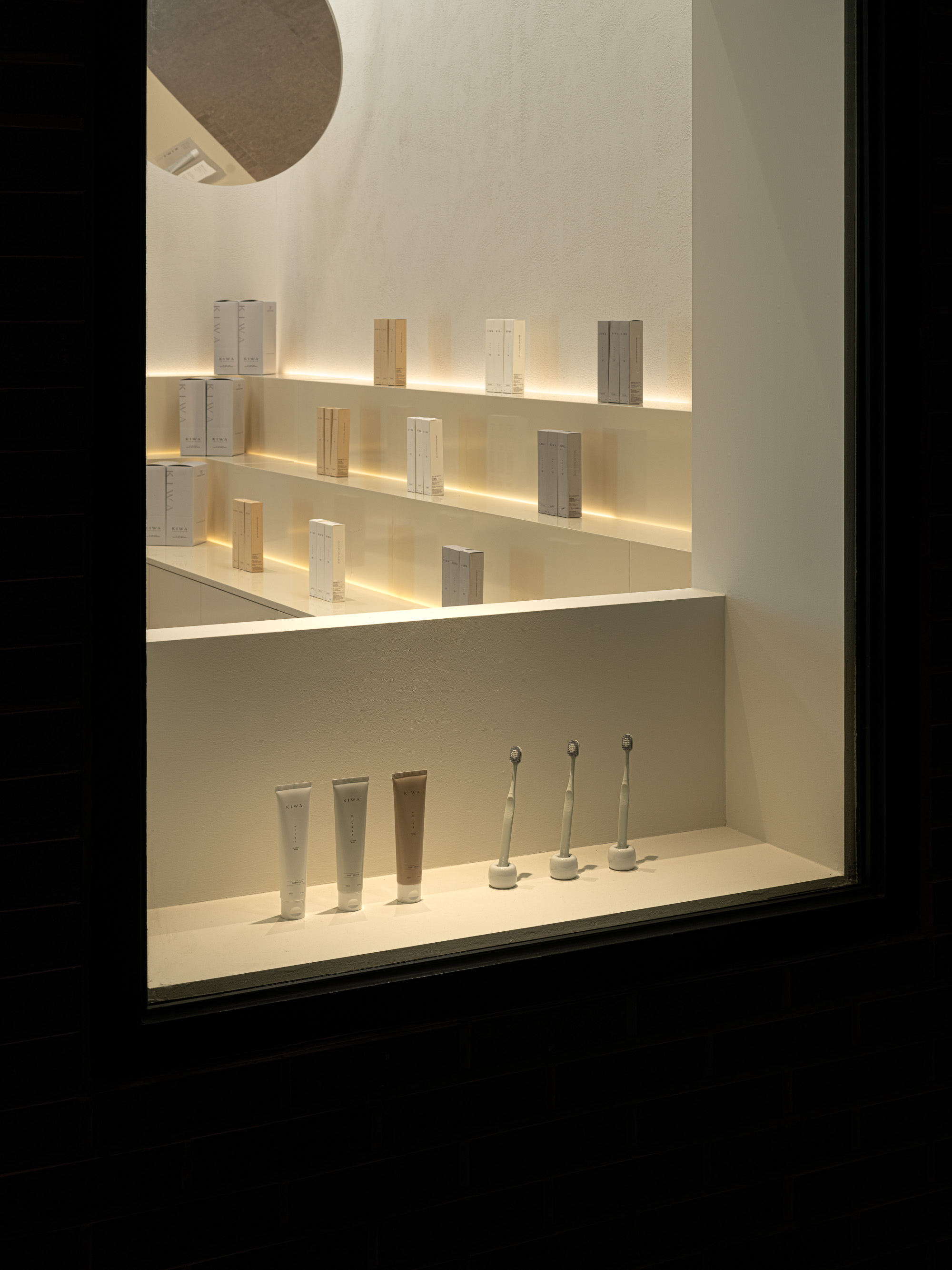
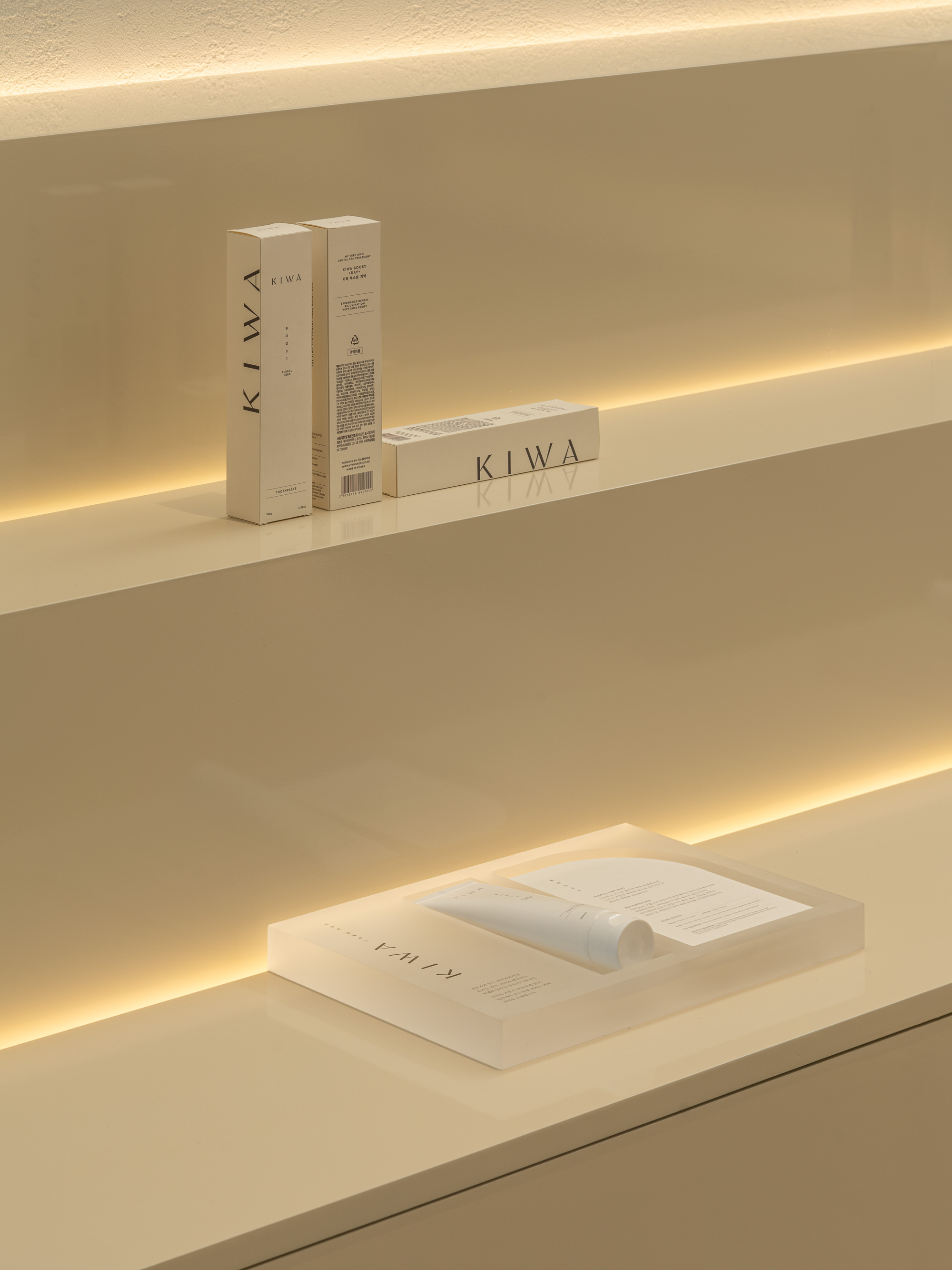
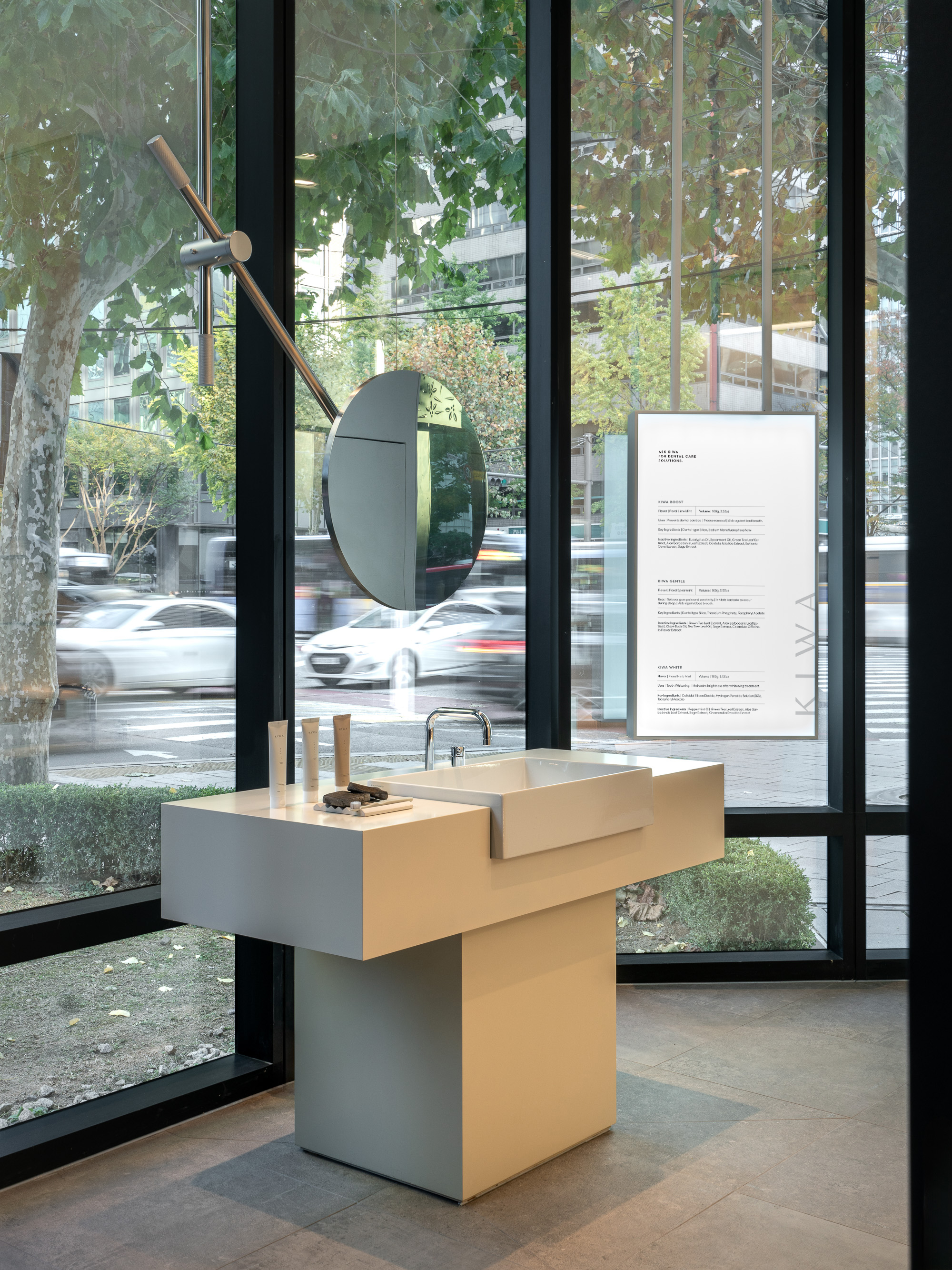
As it is a dental clinic-produced oral care product brand, it was important to convey a clean and hygienic image. Unlike the hospital's image, a combination with the emotional image of a lifestyle shop was necessary.
The concept is "白(white)," emphasizing its spiritual significance rather than its color. The deep "白" of porcelain symbolizes purity and a clean spirit, while the dense "白" of bone is reminiscent of a foundation and unwavering beliefs. In this way, an upright and profound image of "白" was intended to be projected onto the brand and space.
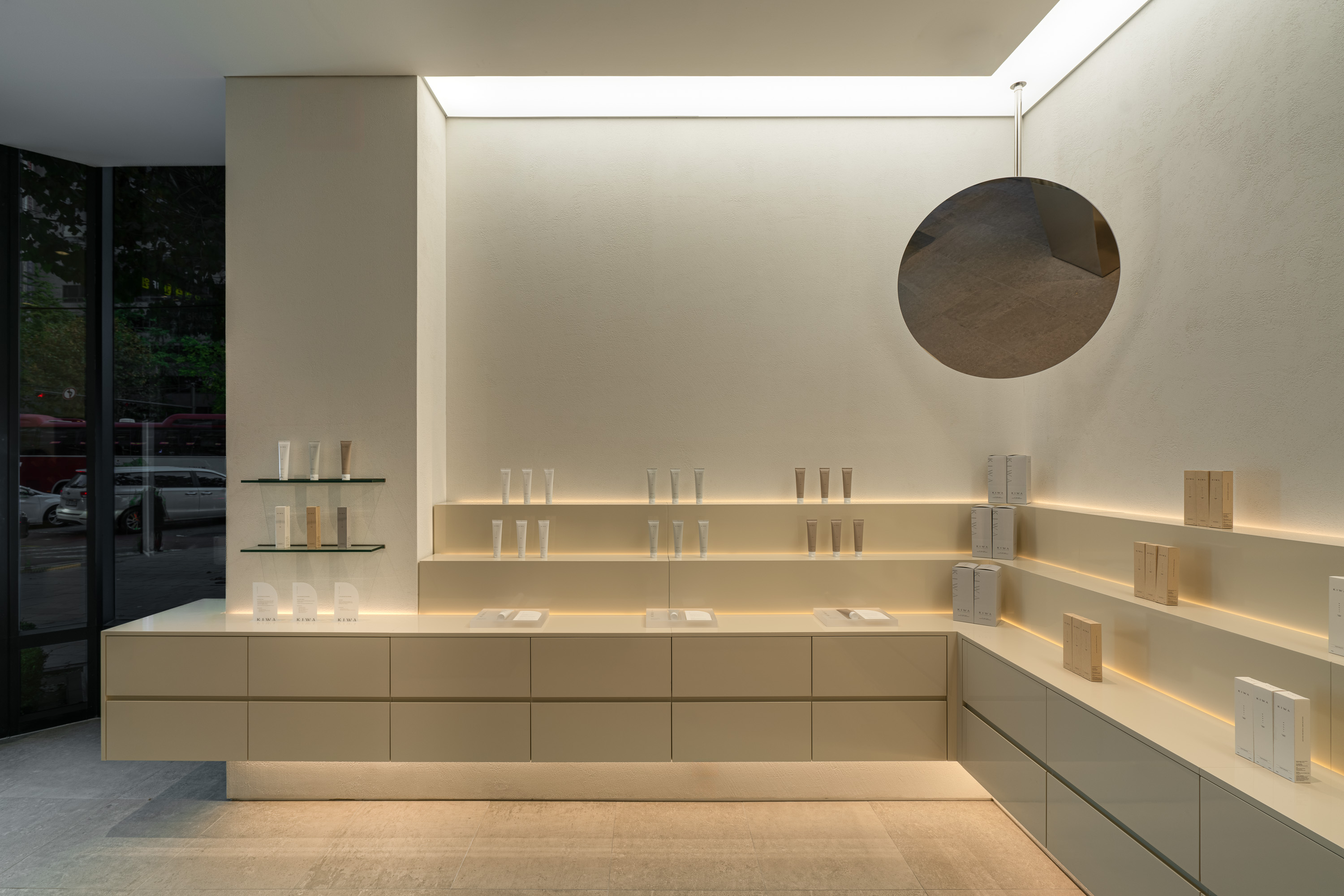
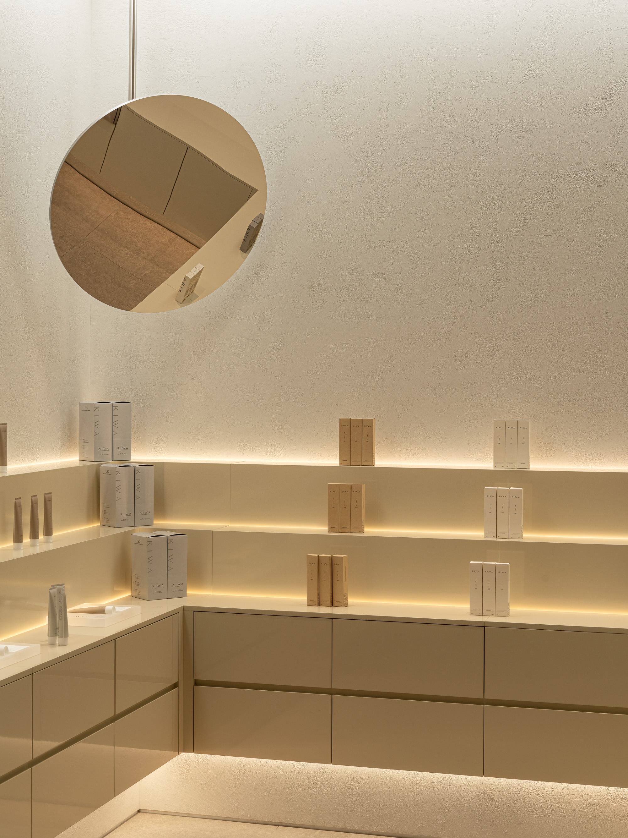
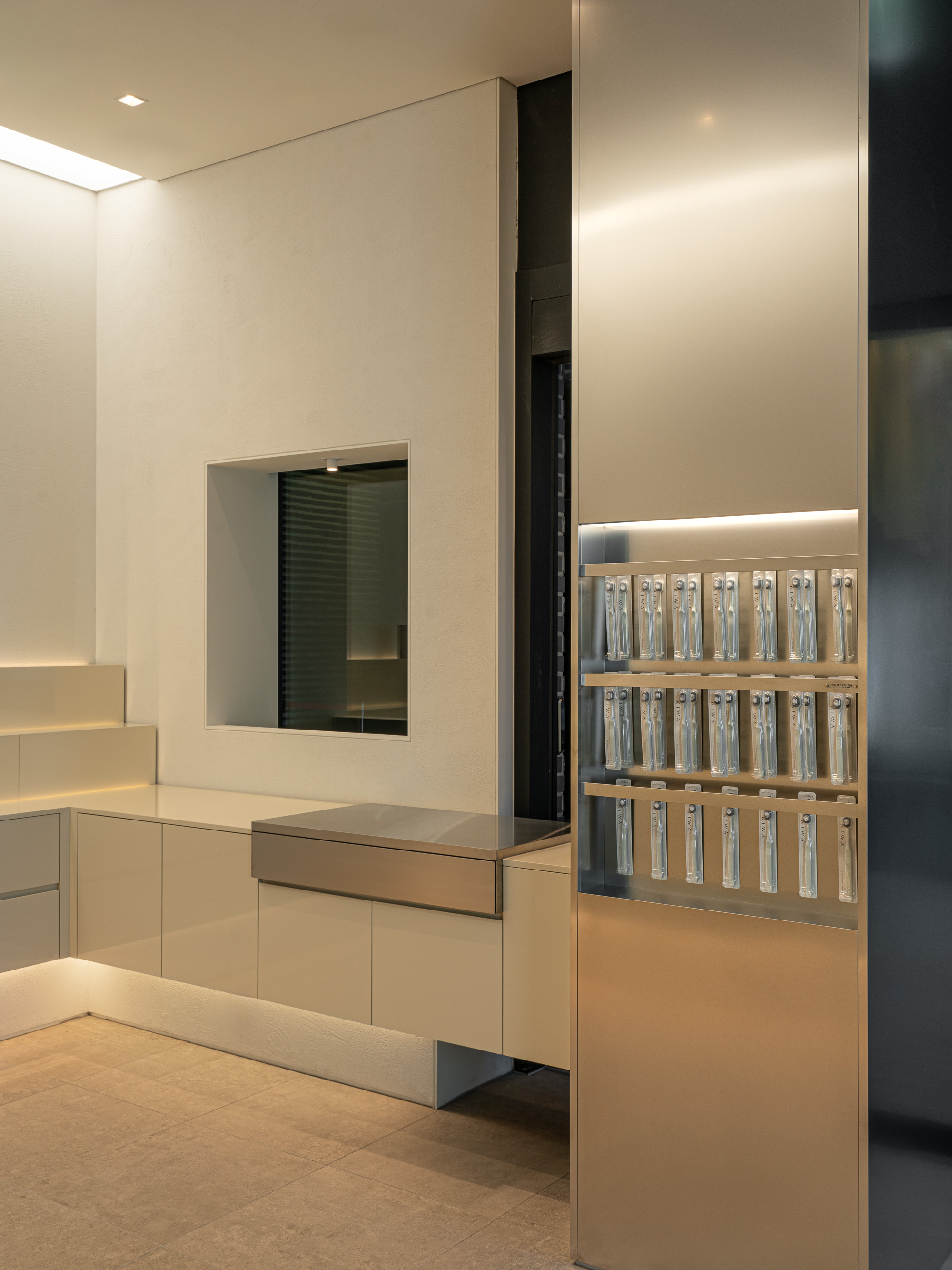
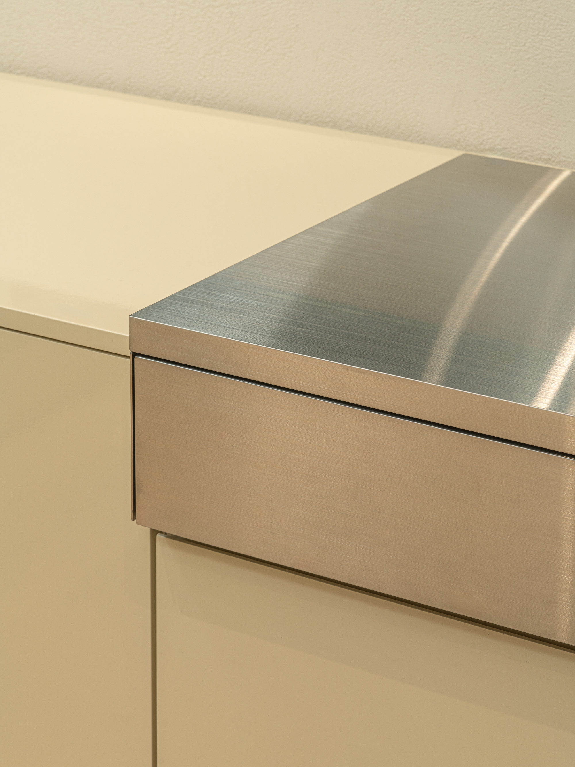
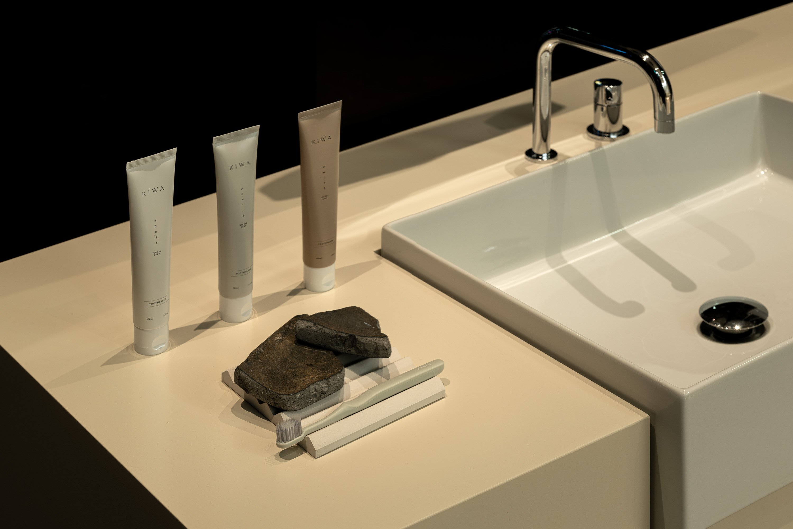
A range of whites, including pure white, off-white, ivory, and beige, were used in a gradation to express the depth of color and texture in the space.
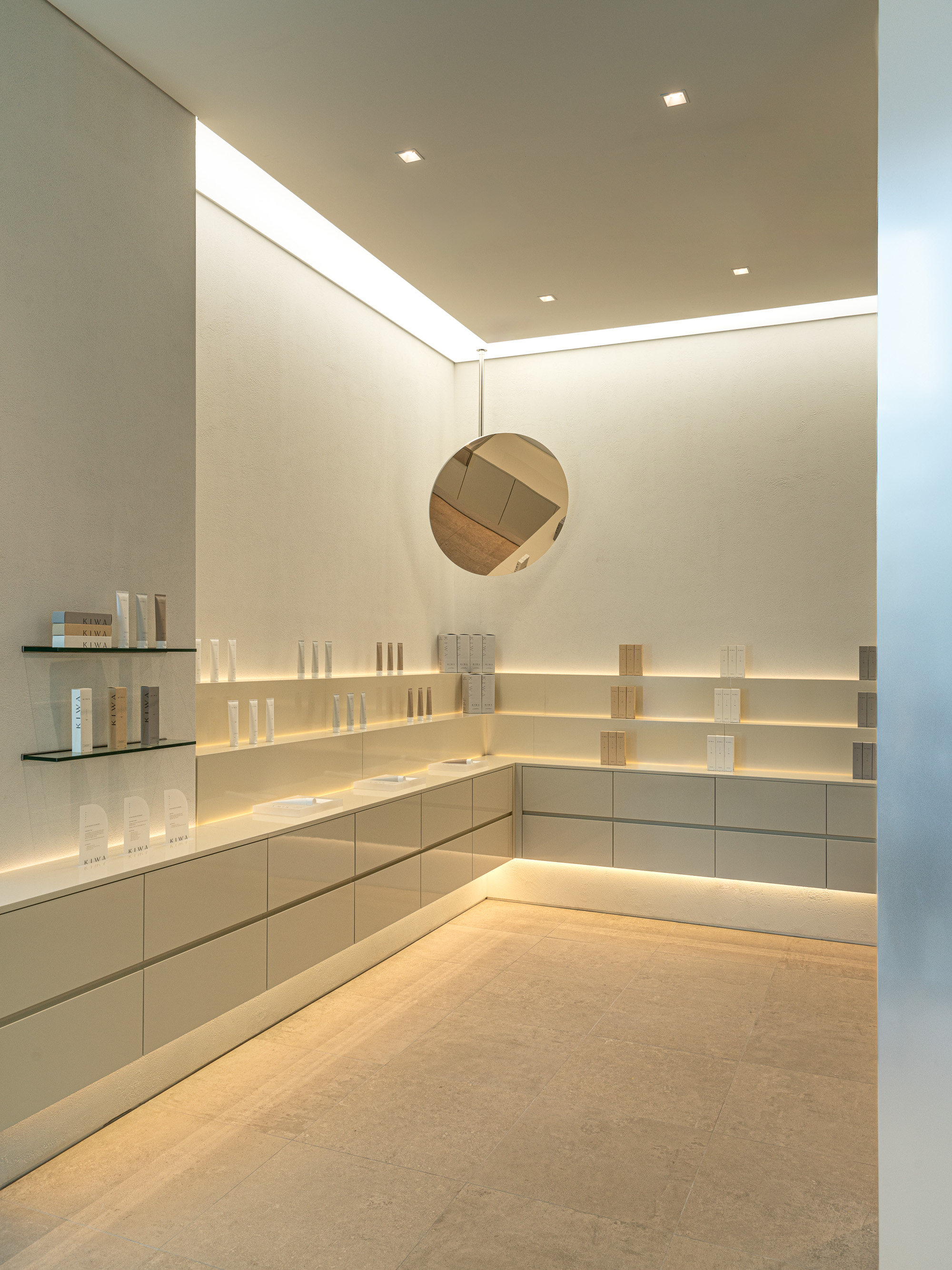
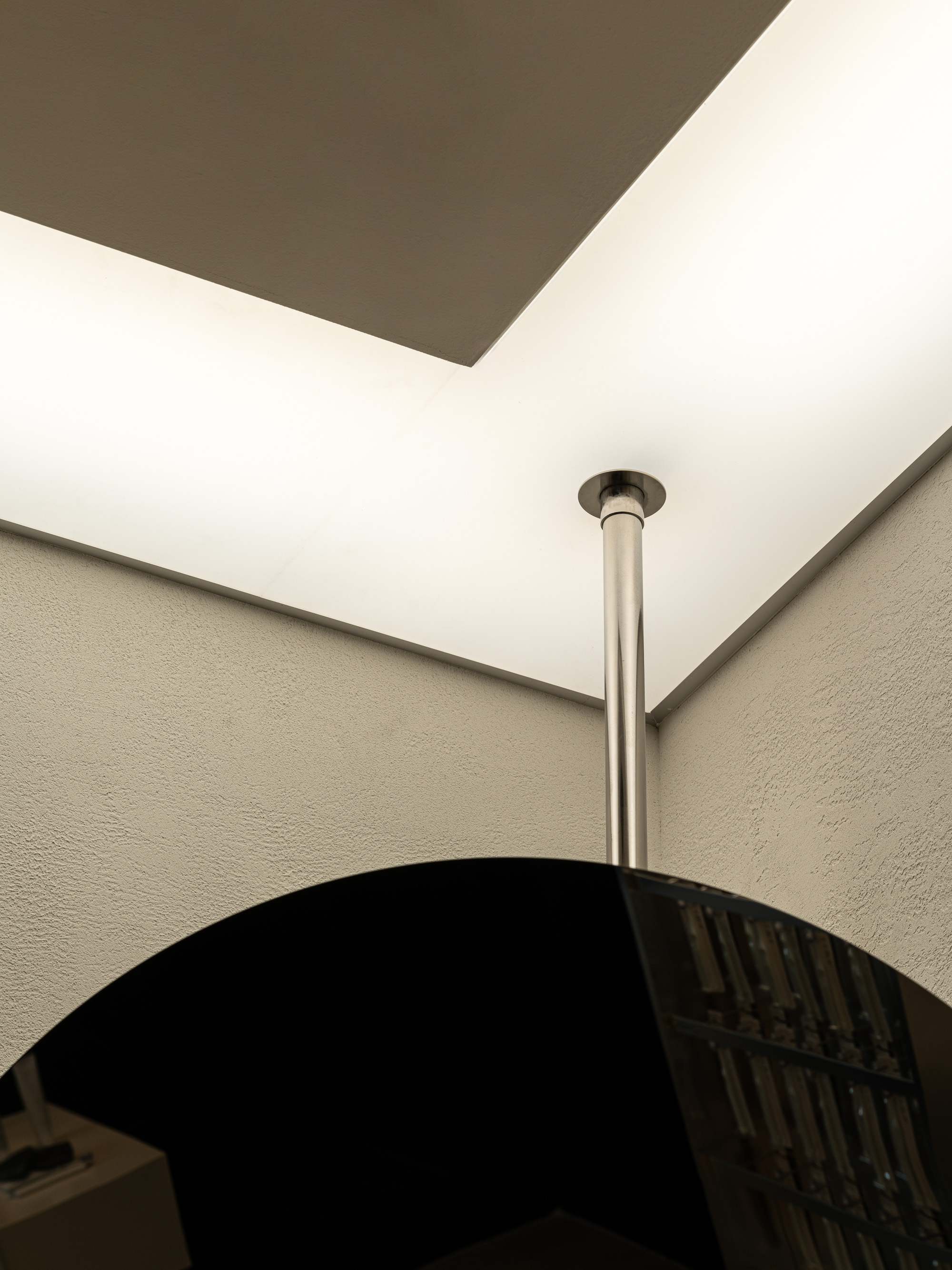
The large mirrors, serving as symbolic elements in the space, were objectified with dental aesthetics as their motif. These mirrors capture the scenery within the space and also reflect the individuals facing them.
Thus, the "白" that felt like a landscape while appreciating the space becomes the backdrop every day in front of the mirror where one brushes their teeth.
Usage : Retail
Location : Cheongjin-dong, Seoul
Floor area: 26 sqm
Year : Nov, 23
Object : OBJECT LEUCI
Photo : Cho donghyun
키와는 광화문 디타워에 위치한 더스퀘어 치과에서 운영하는 구강용품샵이다.
치과에서 만든 구강용품 브랜드라서 깔끔하고 청결해 보이는 이미지를 담고 있는 것이 중요했고 병원의 이미지와는 별개로 라이프 스타일샵의 감성적인 이미지와 결합이 필요했다.
컨셉은 "백(白)"이다. 색상적 의미보단 정신적 의미로써 사용했다.
백자의 깊은 "백"은 순수함과 청렴한 정신, 뼈의 짙은 "백"은 근간과 흔들리지 않는 신념과 같이 느껴지기도 한다.
이처럼, 올곧고 깊이있는 "백"의 이미지를 브랜드와 공간에 투영하려했다.
색감은 백색 농담의 단계별로 화이트, 오프화이트, 아이보리, 베이지 계열을 사용했고, 질감도 매끈함부터 거친 질감까지 그라데이션으로 사용하여 공간의 색감과 질감 깊이의 단계를 표현했다.
공간에서 상징적 요소가 되는 큰 거울은 치경을 모티브 삼아 오브제화 하였다.
이 거울들은 공간 내 풍경을 담기도 하고 거울을 마주하고 있는 사람을 담기도 한다.
그렇게, 공간을 감상하면서 풍경으로 느껴졌던 "백"은 매일 이를 닦기 위해서 마주했던 거울 앞에서 배경이 된다.
KIWA is an oral care product shop operated by The Square Dentistry, located in Gwanghwamun D Tower.
As it is a dental clinic-produced oral care product brand, it was important to convey a clean and hygienic image. Unlike the hospital's image, a combination with the emotional image of a lifestyle shop was necessary.
The concept is "白(white)," emphasizing its spiritual significance rather than its color. The deep "白" of porcelain symbolizes purity and a clean spirit, while the dense "白" of bone is reminiscent of a foundation and unwavering beliefs. In this way, an upright and profound image of "白" was intended to be projected onto the brand and space.
A range of whites, including pure white, off-white, ivory, and beige, were used in a gradation to express the depth of color and texture in the space.
The large mirrors, serving as symbolic elements in the space, were objectified with dental aesthetics as their motif. These mirrors capture the scenery within the space and also reflect the individuals facing them.
Thus, the "白" that felt like a landscape while appreciating the space becomes the backdrop every day in front of the mirror where one brushes their teeth.